Last week I was reading some content online about self-formatting the interior of a book, typesetting and making the layout work. I was struck by how ‘jargony’ the terminology is, like a lot of industries I suppose.
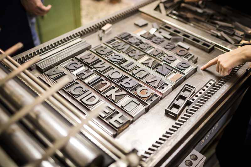
 Don’t forget, when typesetting language was first created, all type was set in blocks, by hand. Not on computers!
So here’s a summary of some jargon you might come across when formatting your book ready for self-publishing, and what those terms actually mean:
Tracking
The spacing between words on a line. You can adjust the tracking to make the text easier to read.
Kern
The space between consecutive letters in a piece of text. Depending on the font and typeface used, the spacing between letters, particularly with capital letters at the start of sentences, may not be consistent across the page. You can adjust the kern to make the layout more uniform and improve readability.
Leading
The space between vertical lines of text. If text is too closely packed together vertically, the lines can be difficult to read. Adjusting the leading between the vertical lines will help.
Typeface
A common design between a family of type or characters. In old printing, the typeface would be the design and style of text that was chosen. So Ariel would be the typeface.
Font
A particular size and style of a given typeface. In old printing, the font would be the ‘styling’ given to the typeface. For example, bold, italics, point size etc.
So Ariel, bold in 16 point was a different font to Ariel, medium in 14 point.
Point size
Different sizes (usually height) of text. The larger the number, the larger the text. There are 72 points in one inch or 2.54 cm.
Weight
The thickness of the text. Weight can be bold, medium or light.
Serif
A typeface design with ‘tails’ at the end of the letters.
Sans serif
A typeface design without ‘tails’ at the end of the letters
Mirror margin
This is used to make the outside margins on the left hand and right hand pages mirror each other in size. When you adjust the setting, it is applied to both the left and right hand pages. The inside margin (margin closest to the spine) is usually larger to allow for binding without any of the text being lost.
Gutter
The inside margins on a page which create a gutter shape in the centre.
Widow
The last line of a paragraph goes onto the next page, separated from the rest of the text.
Widow can also refer to the last word of a sentence which goes onto the next line alone.
Orphan
The first line of a paragraph that appears on its own at the bottom of a page, separated from the rest of the paragraph.
Rags
A ‘ragged’ vertical margin created by a block of type. This is usually the right hand margin, and can be distracting for the reader.
Bleed
A term referring to the edges of the pages being trimmed in printing and production. The bleed is the area that’s trimmed off. It gives a margin for error, and ensures design elements extend to the edge of the page if required. If part of the design in within the bleed lines there is no risk of it being trimmed off in production.
Running heads
The notes at the top of each page which are there to help place the reader within the story.
We’d love to hear what other jargon you’ve learned along the self-publishing route! Share your comments with us below.
We’re Peter and Caroline O’Connor. Creating beautiful book cover designs for authors all over the world is our passion. Every author should be able to benefit from a beautiful book cover design (not just the lucky few who get signed by a big publisher). We design, podcast, and coach authors full-time so we understand your struggles. Currently accepting new clients.
